

In countries whose politicians are elected to represent regions or districts, elections are times of maps, maps and more maps. In the USA, Canada and the UK, geographical maps are the most common visualization tool for predicting and showing electoral results. This isn’t surprising since national and regional maps are immediately familiar to people, and therefore have a low barrier to comprehension.  The trouble with maps is that they emphasize relative geographical size at the expense of importance. Montana will always be three times the size of Florida geographically, but Florida has nine times as many electoral college votes). In the UK, about one in five people live in or around London (and thus Greater London has about the same proportion of seats in the House of Parliament) and yet on a national map, it takes up an insignificant amount of space.
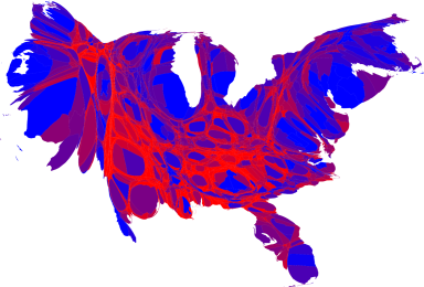
 There are, of course, other ways of mapping results. Mark Newman of the University of Michigan garnered some attention with his cartograms of the 2008 US election results that distort the US so that the size of each state or county is proportional to its population. (Wikipedia says: “A cartogram is a map in which some thematic mapping variable - such as travel time or Gross National Product - is substituted for land area or distance.”) The effect is particularly startling on the county map, where the “normal” version is far more Republican-red than a cartogram version. Rural counties are larger and tend to vote Republican but make up much less of the population than the first map might suggest. I find Newman’s maps interesting, but I doubt such maps would appear on any newspaper since they appear so alien and unfamiliar.

 The British media, however, seem to have cottoned on to the utility of proportional maps, and their efforts are a lot easier on the eyes. BBC, The Telegraph and The Guardian all published cartograms of the 2010 British electoral results, and I find they provide more useful information than the regular maps. On the geographical map, England appears to be a sea of Tory blue with a bit of Labour red and Liberal Democrat orange around the fringes of Scotland and Wales, when in reality, Labour did quite well in Northern England, in Scotland and around London.
 I’ve never seen a similar sort of cartogram for Canada, despite the fact that Canada has, if anything, the “worst” relationship between land and population of any Western democracy—35 million urbanized people in tiny pockets of the second largest country on Earth. Geographically-based electoral maps of Canada, such as this effort from Elections Canada, or the CBC map at right, therefore offer almost very little value since most of the seats are dwarfed by the vast, relatively empty stretches of land. Roughly one-third of the people live in Vancouver, Toronto or Montreal, whose combined size makes up only about 0.2% of the landmass. As I say, I’d never seen a cartogram for Canada, at least not until the other day when The Globe and Mail published one, but only in their print edition, and they still decided to overlay it onto a real map.
Awhile back (before I saw this G&M effort), I had decided to try my hand at creating a cartogram of Canada that would help show how many people live in the cities, and how few live in, say, Nunavut or Northern Manitoba. I hadn’t actually intended the exercise to be specifically electoral, but the 308 seats in the House of Commons are nearly evenly divided by population and so make a fairly accurate picture. (There are exceptions—Prince Edward Island is guaranteed four seats in the constitution but would only warrant one by population, and the three territories each have one seat but barely warrant one combined).
Here’s the result, colour-coded with Canadian political colours: dark blue for Conservative, red for Liberal, orange for the New Democrat Party (NDP), light blue for the Bloc Québécois (BQ), and one grey seat for an independent. Click to zoom in, or there’s a PDF version:

Naturally, I had to take some geographical liberties to squeeze some large places into small squares, but for the most part, places that are next to each other in reality are next to each other on this map. A few things you might notice:
Vast stretches of land have disappeared. Yukon, Northwest Territories, Nunavut and Labrador are four seats squeezed at the top. I chose to let Saskatchewan maintain some width to keep geography more consistent, which means it has some weird gaps.
Ontario and Quebec are really big. In fact, together, they make up nearly two-thirds of Canada’s population, so it is what it is. Similarly, the 49th parallel, which appears to be the bottom of Canada on normal maps, is quite high up here since in reality, the majority of Canadians live south of it.
Northern Ontario appears relatively small (it’s actually enormous), but is solid orange, while the rest is mostly red and blue. This is reflective I think of the great political distance between Northern and Southern Ontario.
If you look closely, and are familiar with city and suburb names, you’ll notice that almost all of the Conservative strongholds are outside the major cities (with the exception of Alberta) while the cities are pretty solidly Liberal with sprinklings of NDP. The giant red section in the middle is Greater Toronto, and the red section in Quebec is Montreal—a red island in a sea of BQ blue. Overall, Canada is quite regionally divided, making it difficult for any party to win. The reason the Conservatives have been able to win even a minority is a strong base in the prairies combined with national support in rural areas and smaller cities. Outside the maritimes, the Liberals have become a purely large-city party.
Comments/suggestions welcome!
Update: I’ve created a new web version with updated results from the May 2 election. You can read about it here and you can view it at electoralcartogram.ca.
7 Comments