Twitter Ads campaign creation experience redesign
Spring/Summer 2013 ·
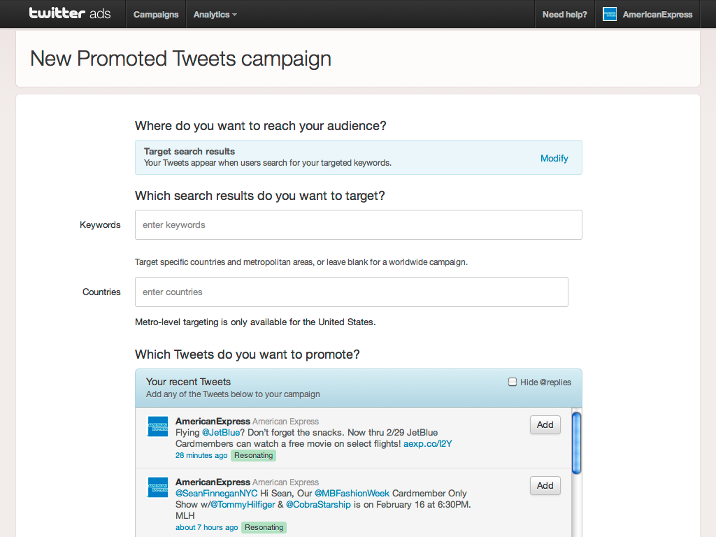
From the introduction of advertising on Twitter in 2010 through to the end of 2012, there was a lot of emphasis on adding features to the product to meet advertiser demand, and to bring Twitter’s capabilities in line with competitive platforms. By early 2013, what had been a relatively simple product — add a few keywords, filter by location, and choose a few tweets — had become quite complex. The array of features gave customers more capabilities but also introduced confusion and many opportunities to make mistakes.
Project context
In 2012, we had experimented with a streamlined, simplified product to meet small business demand. That product had garnered mixed results. Novice users struggled with creating engaging content on the platform, while more experienced users wanted more control. The team made the decision to shut down the simplified product and push all customers to the older, more advanced product, in effect focusing our energy on higher-spending customers. The older product had been designed for customers receiving phone and in-person help from the sales and support team. For “self-serve” customers without that assistance, it needed improvement, particularly to the campaign setup process. At the same time we knew we could improve the experience for existing customers, and help them make better decisions too.
Armed with years of research and feedback about the existing product, I convinced the product team that this was a vital project for the success of the product with new and future customers. We set about designing and building a set of improvements to the experience. As part of setting the scope of the project, we agreed that we would avoid avoiding any significant changes to the capabilities of the product, and instead focus on helping users understand what was already there.
Adding a product introduction and visual aids
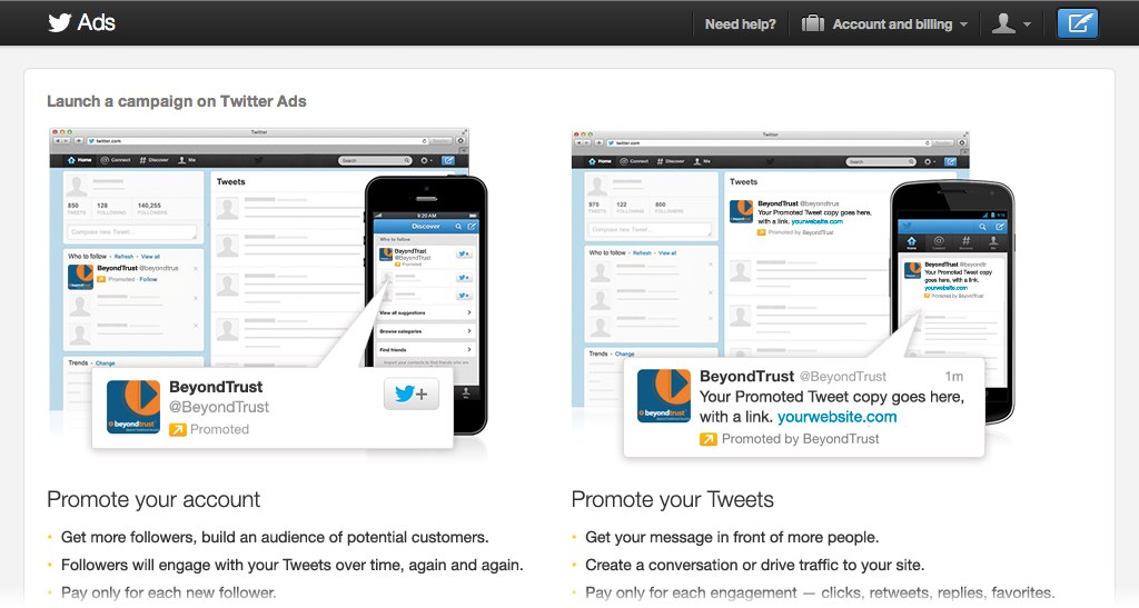
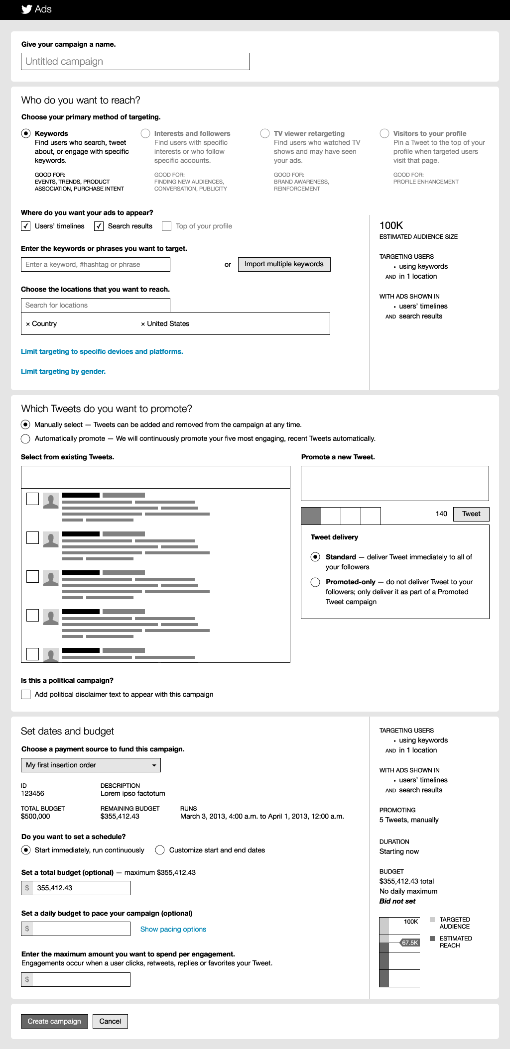
The existing product had essentially been one long form. Without any real introduction or guidance to make the necessary choices while setting up a campaign, users frequently made mistakes and hit dead ends. They struggled to understand the impact of each decision. Research told us that newer customers were often unfamiliar with ads on Twitter before starting to use them. To address that, we decided to add an introduction page, showing users what ads on Twitter look like, where they appear, and explaining what the two types of ads (Promoted Accounts and Promoted Tweets) were intended for. We also added more visuals in the setup process, making it clearer how particular decisions would impact the appearance and placement of ads.
Goal-oriented guidance

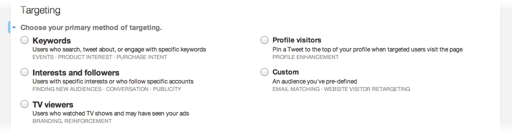
We knew that self-serve customers in particular struggled with understanding why to use one form of targeting or another, so we re-wrote and redesigned the “primary targeting” input to set more context and suggest why one might use, e.g. keyword targeting versus interest targeting. We also made the layout of the component more flexible than it had been to make room for new ways of targeting in development, e.g. TV-viewer targeting and customer-data targeting (later called “Tailored audiences”). We also discussed the idea of a stronger approach: one where the user indicates their goal first, and the system guides them through the right decisions to achieve that, but at the time of the project, we felt such an approach would fail because the product did not yet satisfy many common marketing goals, and we also lacked the reporting necessary to communicate the results of campaigns in those terms. (We later revisited this in a subsequent project dedicated to goal-based campaigns.)
Progress, organization, summarization
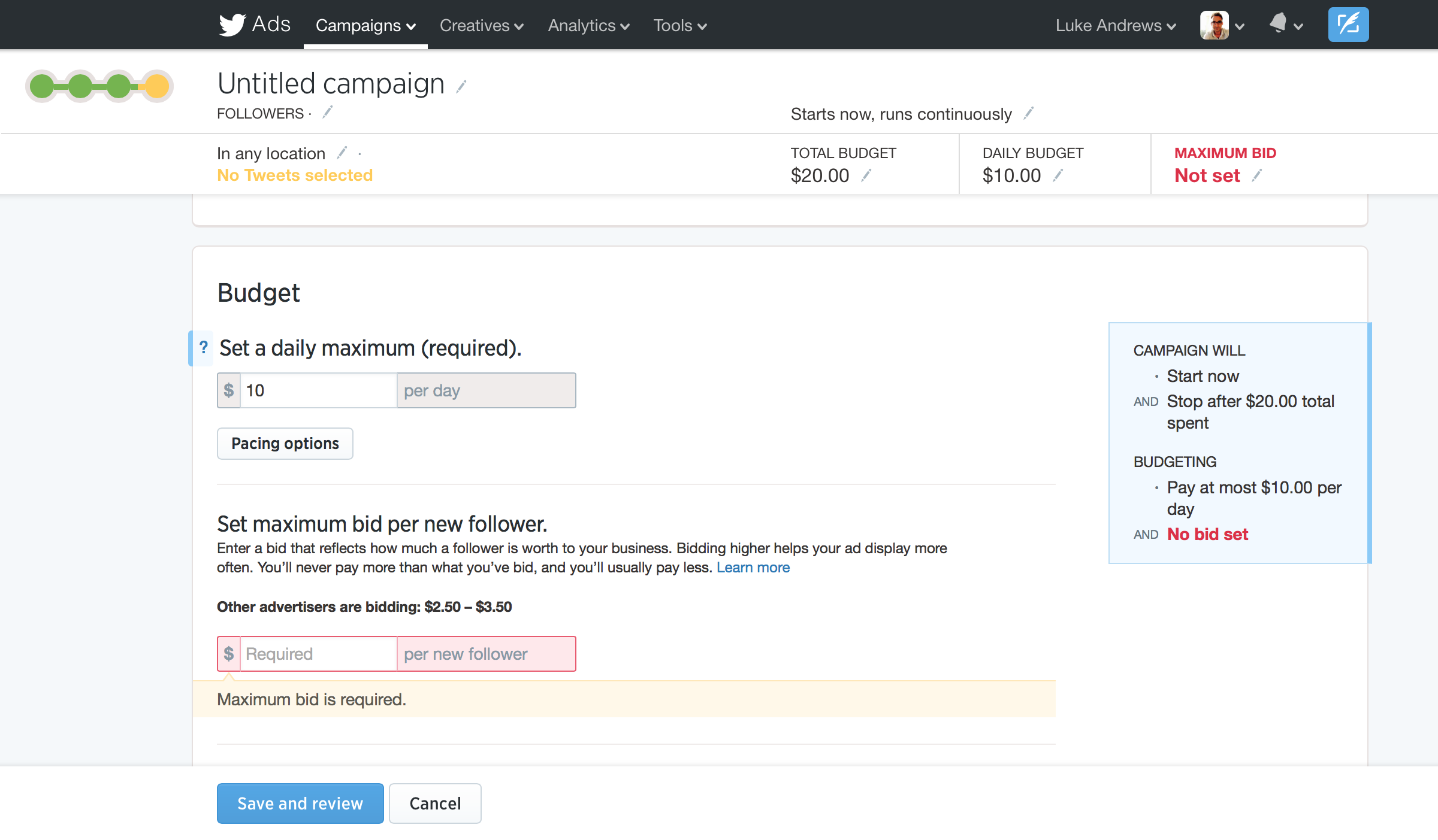
The old campaign form started as a simple form, but gradually became longer and longer, with more interdependent pieces. Users needed to fill out the entire form and click save, with no mistakes along the way, or else risk losing their work. So we created a “draft mode”, allowing users to save partial, incomplete campaigns. We made the save button visible at all times (pinned to the bottom), and introduced a way to find draft campaigns when returning to the product later.
We also divided the form into logical sections, and introduced a light grid, giving the page more structure and making the workflow clearer. We designed the progress bar both to signal completion of each section and to aid navigation.
As users progressed through the form, we gradually expanded a summary of their decisions pinned to the top, both as a form of confirmation (“Yes, you chose keyword targeting.”), and as a way to highlight what steps they may have forgotten (“You forgot to set any keywords.”). The summary also acted as a secondary navigation element — clicking any part of it would take you to the relevant section and form input.
Within each section, we more clearly delineated each input as a separate step, with consistent headers, both in appearance and voice (always using complete sentences). We created a new design for help text, with a small affordance “bump” on the side. For brand new users, we believed the help text would help them understand their decisions, but for more experienced users we expected extra text would feel cumbersome, so we designed it to automatically collapse help text once users had created a few campaigns. The bumps served a dual purpose: they allowed users to toggle help text on or off as needed, and they also acted as a visual aid, giving the form a more distinct shape and drawing one’s eye to a decision point.
We also pushed some more advanced functionality of limited interest into hidden sections that could be expanded as needed, but which the system would try to be intelligent about — e.g. if you chose to expand options for controlling the pace of spending, and later re-visited the campaign, that option would remain expanded.
Such patterns were designed to be re-usable so that when new features inevitably arrived in the future, there would be a more obvious starting point for how they would look, and for how they would blend into the existing flow, saving engineering and design time, but also limiting the need for users to learn new interface patterns.
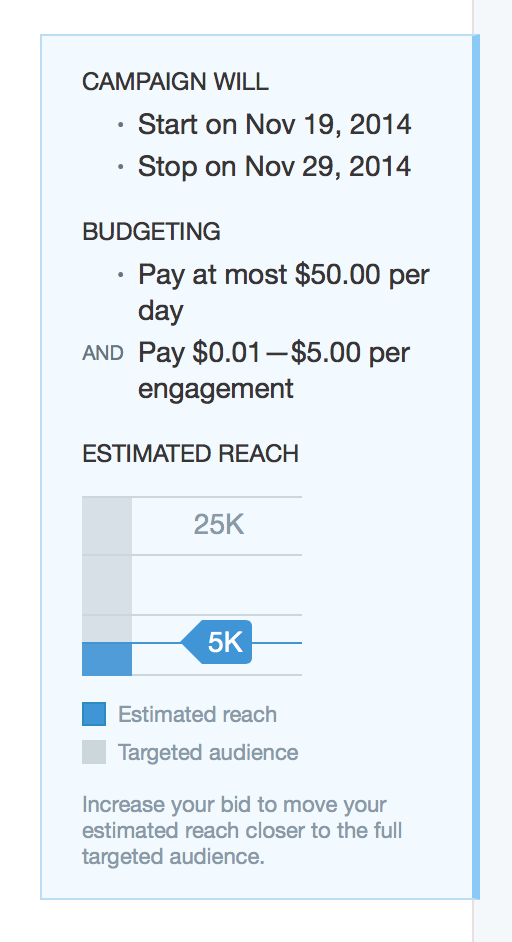
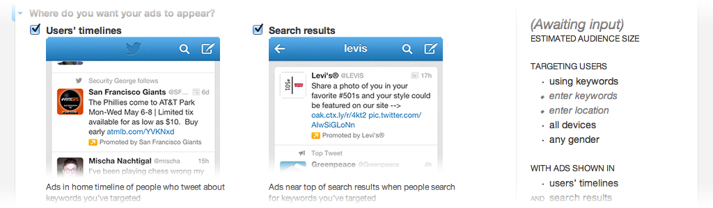
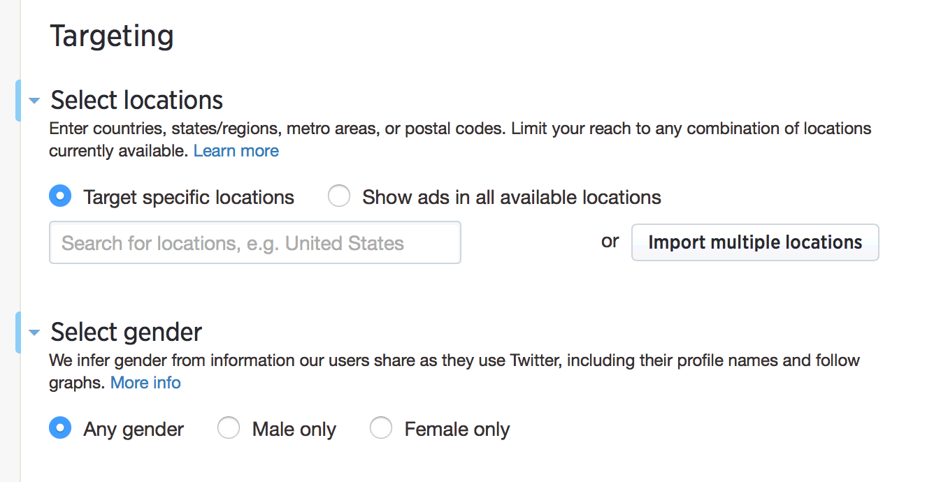
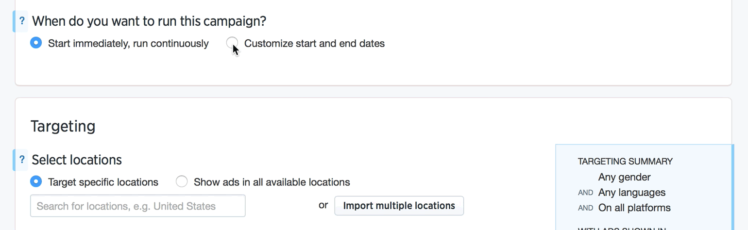
Finally, we added sidebars in sections where we knew from research that the impact of decisions together could be confusing for users. In the targeting section, a sidebar showed you how certain choices combine in “AND” or “OR” fashion. In the budget section, a sidebar showed users under what circumstances their campaign might start and end (due to budgets and dates), and how much they would be spending. We also tried to draw more attention to the estimated reach of a campaign with a chart that responded dynamically to changes to targeting and budget. In general, I put a lot of emphasis on making all of the text on the page dynamic, so it would always be showing the impact of decisions in real time.
Instant feedback
One of the most frustrating aspects of the old campaign form for customers was the lack of warning about mistakes during the process of completing the form. As part of this redesign, we introduced a new input validation system, showing users immediately when their input was invalid or conflicted with some other part of the form (e.g. setting a daily budget in excess of a total budget, or trying to set an end date before the start date). We designed the feedback to be eye-catching, inline with the input fields, while trying to avoid making it seem hostile or “angry”. Moreover, we put considerable effort into writing clear, precise error messages (e.g. “The start date must be before the end date”) instead of vague, technical-sounding error messages (e.g. “Invalid date range”). The progress bar and summary also helped by showing immediately, with color-coding, whether a section was valid and complete.
Consistent presentation of campaign setup details
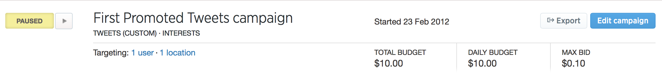
Though this project was largely limited to the setup process itself, we also felt it was important to carry through elements of the setup summary to the reporting part of the product, so that as you analyzed performance of the campaign, you would have a reminder of how the campaign was configured, presented the same way as when you set it up in the first place. In the reporting, the progress bar was replaced with a status report that also allowed the user to easily pause or resume the campaign. Ultimately, the summary could also later serve as a quick way to make changes to campaigns (by simply clicking the part of the summary the user wanted to modify).
Design process
I was the sole designer on this project. I began with some initial paper and whiteboard sketches, and fairly quickly turned to low-fidelity designs that defined the layout of the page and how the different components would fit together. Because this project mostly hinged on interactions and behaviors (e.g. feedback to user input and interactive response to scrolling), I avoided any high-fidelity mockups and worked instead on an interactive prototype that I built in HTML, CSS and JavaScript. From there I worked closely with the engineering team to turn the prototype into the end product, while continuing to iterate on the interactions and visual design (although much of the visual design of the page carried over from the design system in use at Twitter at the time). Because I was also the biggest champion of the project, I also did much of the legwork to convince stakeholders of the project’s value, and to update them on its progress. I also wrote the post announcing the project on the Twitter Ads blog.
Testing and release
We did extensive user testing before release, and found that users reacted quite positively to the changes. One thing we tweaked after launch was giving users more shortcuts (e.g. quickly launching a campaign without reviewing the summary) after some expert users told us the new form was slowing them down. Ultimately though, this was a successful project and I’m pleased that the meat of it continued to be in use more than a year later, even after so many new features and other changes to the capabilities of the product. —L.A., November 2014