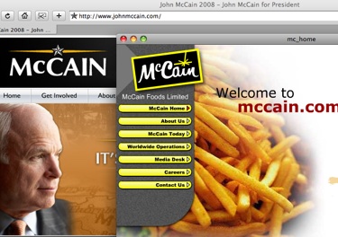
Design writer Steven Heller continues his series on the U.S. presidential race with a look at John McCain’s campaign logo which is set in the typeface Optima.
Optima is second perhaps only to Helvetica in representing modernism in type, so I find it an odd choice for a decidedly un-modern candidate. But what strikes me even more is the use of the star with his name. Where have I seen this before?


Comments