


August 9, 2005 at 10 AM
When Gasoline Is Cheaper Than Petrol
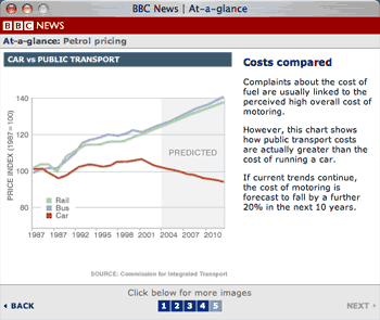
Ah, how I love bad graphs. On the graph above, for instance, from the esteemed BBC, you can clearly see how cars are cheaper than public transport.
Sorry, what? The Beeb uses this graph to suggest that one ought not to complain about the high price of fuel in the UK: “Why, it’s cheaper than taking the bus!”
First off, it’s hard to trust a graph that shows the same year twice (1987). I’m not sure what year the second 1987 is actually supposed to be, because the rest of the graph has ticks in three-year intervals, but if you subtract three from 1992, you get 1989, and subtract three more from that you get 1986, not 1987. So the scale must be wrong to start.
Secondly, and far more importantly though, they make no attempt to explain what this graph is really showing you. It’s a graph of price indexes, not actual prices. That is, if we pretend that the price of rail, bus and car operation in 1987 was “100”, then this graph shows how each has risen or fallen since then.
Except that it’s obvious that rail, bus and car prices were never exactly the same. Equating them in a totally arbitrary year, 1987, is pretty dodgy to start. But even if you do, all this graph is telling you is that bus and rail costs have risen faster than car costs. It doesn’t tell you that owning a car is cheaper than taking the bus (that would be a feat), but it tells you to shut up and quit your whining because people taking the bus have had their costs rise faster than yours.
There’s also no explanation of whether the price changes account for inflation, though I’d guess they do, because there’s no way that gas (or petrol as they say), insurance and car prices have become cheaper overall.
The final injustice in this graph though, is that they use a three year “trend” from 2001-2004 to “predict” how prices will continue to fall or rise over the next eight years. And yet if you look at the years before 2001, the trend is anything but clear. Overall, car prices rose between 1987 and 2001, and most of the increase in rail and car prices was in a short period between, uh, some year in the late ’80s and 1992.
The sad truth is that charts and graphs like these are everywhere in the media. Newspapers and TV news are the worst culprits, but clearly the virus has afflicted the web too. If you remove enough facts from a graph, you can, usually, get it to show anything you want. This is usually the point.
In this case, I disagree with the method, but also the intent. Does the BBC want to encourage people to drive more, and use public transport less? At a time when prices for fuel are at an all-time high?
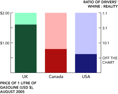
By the way, I should also use this opportunity to point out the irony of Americans and Canadians who complain about the price of gas. Brits are paying on average £0.90 per litre. At current exchange rates, that’s about CAD $1.95 per litre of unleaded gasoline, or about USD $6.00 per gallon (that’s American gallons). Americans currently pay on average USD $2.35 per gallon, while Canadian prices are averaging about CAD $0.96 per litre (about USD $3.00 per gallon).
Of course the vast majority of the difference is tax. Throughout Western Europe, governments add far more tax to gasoline. (Well, to everything really.) It’s difficult not to notice the effect: there are far fewer giant cars like SUVs in Europe, and far more small, efficient vehicles. If American and Canadian governments really wanted to stop their drivers from complaining, all they have to do is start saying, “Look how much worse it could be!”
Or they could simply examine my handy graph:
Previously: On Colour Blindness
Subsequently: Still More Mac Advocacy


Comments
———
I’ve spent the Summer working for a law firm in Calgary, Alberta. Our clients are the likes of Imperial Oil, Petro-Canada, BP, etc. Nobody’s unhappy about US$67 barrels of oil. If you can’t afford your car, come to Calgary!
— Chris | Aug. 14, 2005 — 5 AM
Yeah - I find that people use these things to cheer themselves up or promote their cause as well. This graph was recently on a newsgroup I participate in to show how blogging is taking over the mainstream media. Look at those numbers! But if you have no reference, its a pretty meaningless graphic. FWIW, this represent incoming links. So, surprise, on the web, websites are more influential than traditional media like newspapers and television.
— Brett | Aug. 15, 2005 — 11 AM