Twitter Ads objective-based campaigns
Winter/Spring 2014 ·
Towards the end of 2013, Twitter turned its attention to attracting new customers, focusing on businesses that were not presently succeeding with the platform. The advertising team planned new features for performance-focused marketers with narrow, measurable goals. A major component of this was building a new set of Twitter “cards”, extensions to tweets that solicit actions like installing a mobile app or watching a video. They also planned a new “conversion tracking” tool to follow users from an ad to a website or into an app, and “Tailored Audiences”, a set of tools to cross-reference advertisers’ customers with Twitter users to target campaigns more effectively.
At the same time, even after we redesigned the campaign setup experience in 2013, we knew that many customers struggled to understand the results they were getting. Others didn’t understand how to make the best use of the existing raw tools. The planned, new features could certainly be effective if adopted, but I worried that without a story tying it all together, our customers would continue to struggle. To minimize disruption and develop faster, the initial plan was to layer new capabilities on top of the existing product, making each one feel like an advanced feature rather than a core part of the experience. Customers that failed at a basic campaign would likely never take the time to configure new cards or set up conversion tracking if they felt like tools for power users.
Re-thinking the underlying story
I began pushing for us to re-think the underlying product to address this problem. At first my focus was on finding ways to show the existing value of Twitter more clearly to potential advertisers, to help them succeed and gain the confidence to adopt more advanced tools. But as we looked at the problem more, we realized that these new tools were fundamental to even limited success. Twitter wasn’t a valuable platform for many of these customers; we needed to make these new capabilities part of the story of running one’s very first campaign.
Since the introduction of Twitter Ads, advertisers had been given a choice between Promoted Tweets, to promote messages to a targeted audience, and Promoted Accounts, to gain more followers. All of the power of the platform was compressed into two concepts that seemed unnatural to many advertisers. The features built to help different types of customers achieve different goals were buried in complex forms and menus.
Working closely with the product team, I proposed a few possible directions that I felt would help solve this problem, with a focus on what the initial offering would be to a brand new advertiser.
Focus on the funnel
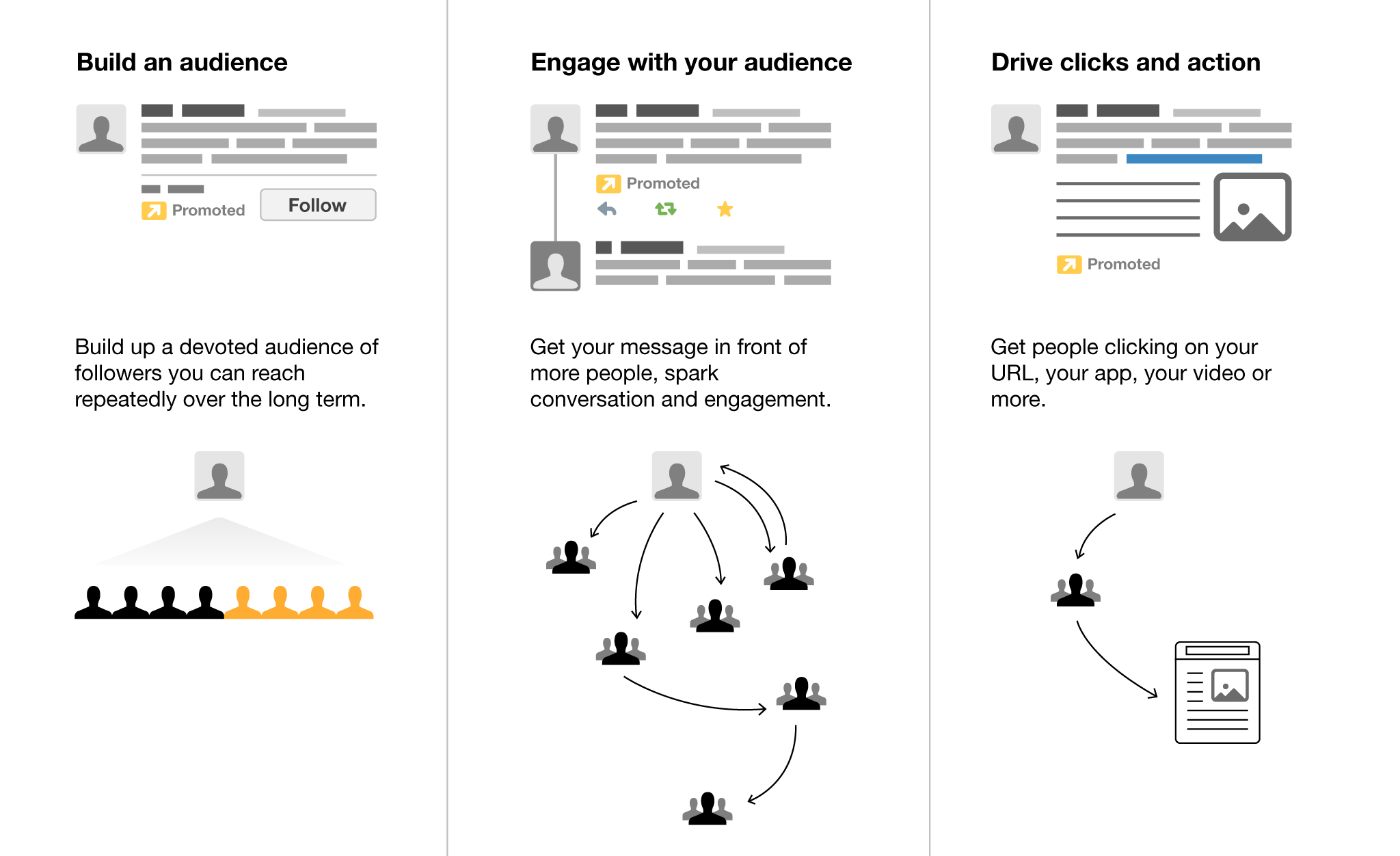
The first idea was to divide the product into three core concepts: “building an audience” (gaining followers), “engaging with an audience” (communicating with customers inside the Twitter platform), and “driving clicks and action” (generating a measurable outcome, often outside the platform). The three concepts correspond roughly to a traditional marketing funnel, and I liked how the existing advertising products fit neatly into the first two concepts, while the third was broad enough to contain many of the objectives of our target customers. There was some concern though that these concepts didn’t call enough attention to the specific marketers Twitter was pursuing most aggressively: those promoting videos and mobile apps, and publishers seeking website traffic.
Focus on goals
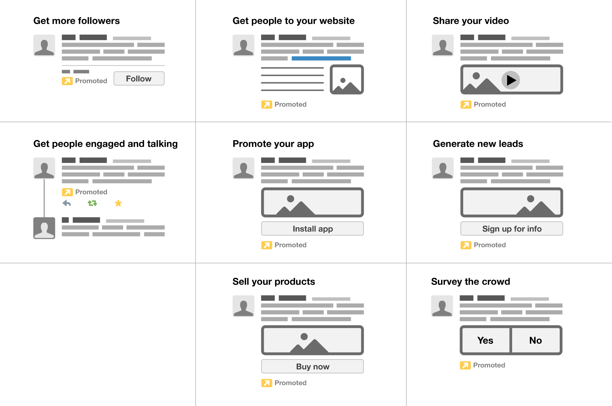
A second idea was to focus on marketing goals a business might have, e.g. “lead generation” or “customer communication”, while showing how tweets could meet those goals. While appealing in its clarity, we worried that we would not be able to present a complete set of goals, and that different users might have different definitions for the same concept.
Focus on outcomes
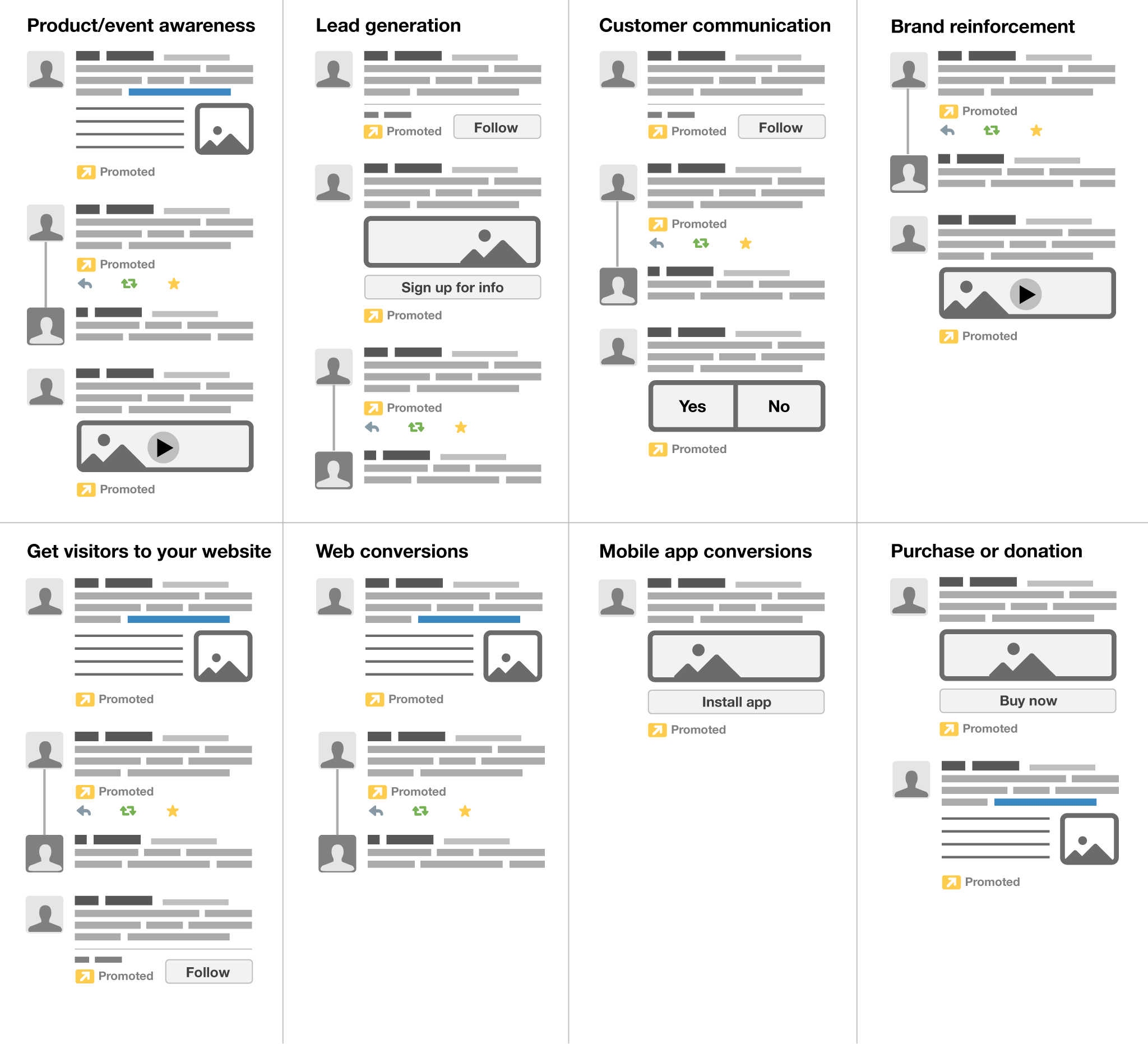
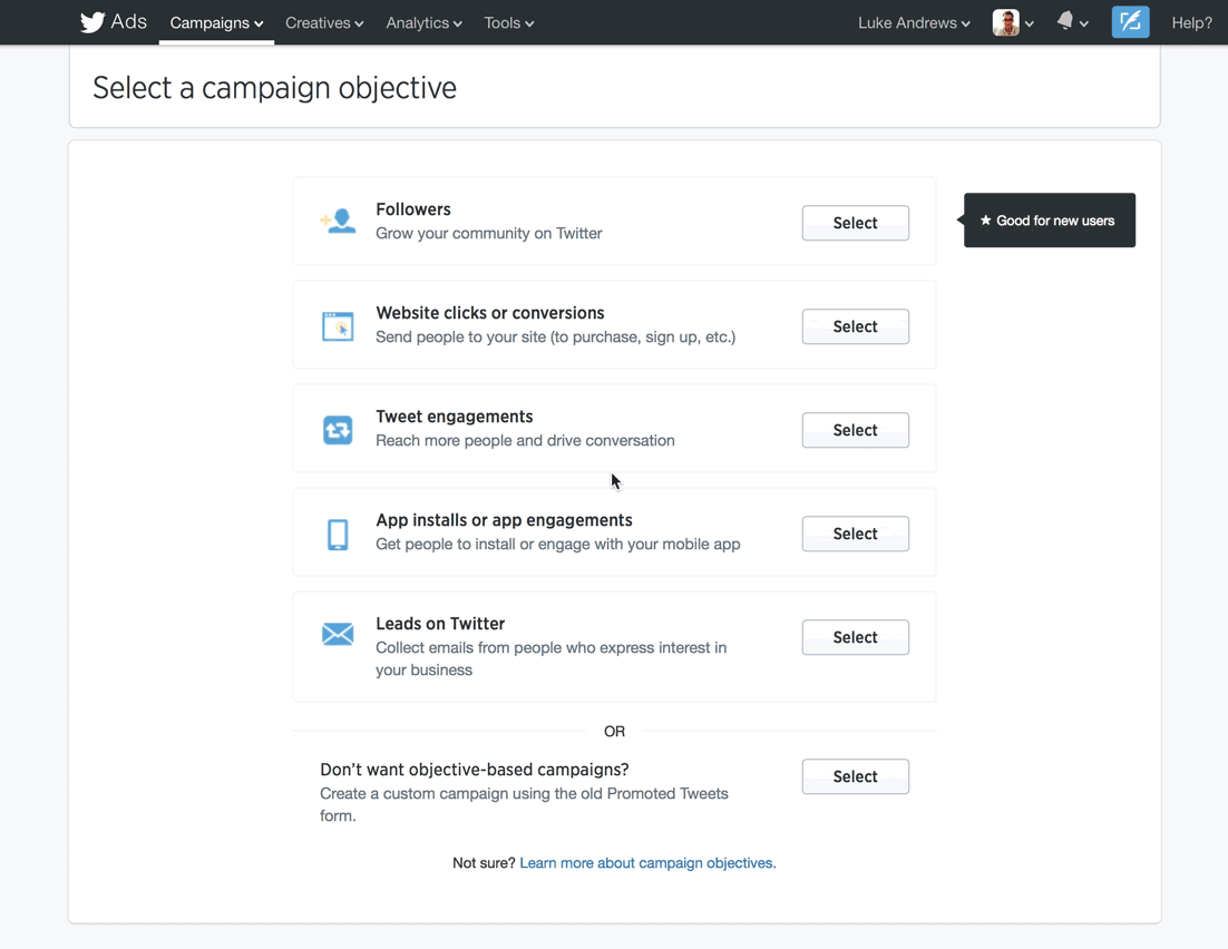
A third idea was to present the concrete outcomes that a campaign on Twitter could deliver: e.g. acquiring more followers, installing an app, or watching a video. We knew we could highlight the different types of cards, showing how these ads would differ and how effective they could be. This approach also had parallels to some competitive offerings, which meant that it might be easier to understand for advertisers already familiar with other ad platforms.
Ultimately we moved forward with the third idea, and began testing variations of the language with our advertisers to see how they responded to the concept and whether the outcomes seemed intuitive. At the same time, we began to design the three major pieces we needed for the project: 1) a new introduction to the product that would show the different types of campaigns, 2) changes to the campaign form that would make it easy to use cards for campaigns, and 3) changes to measure and report the appropriate results.
I worked extensively on the campaign form changes, creating the first set of low-fidelity designs, and I worked closely with the two other designers that worked on the introduction and reporting changes. (As the project progressed, I stepped back from individual contributions and my role became more supervisory.)
Risk-averse process
Significant changes to an established product always risk doing more harm than good. To mitigate that, the team followed a research-driven, iterative process to build the product. We emphasized lower-fidelity designs and prototypes that we could test over sweating each pixel, and then we repeatedly redesigned following multiple rounds of usability testing. A number of changes came out of that process, but one of the most significant was to preserve the “legacy” Promoted Tweet campaign product, allowing experienced customers to keep a more open-ended, flexible process. We realized, however, that we could re-cast this as a “Custom” option, elevating it to a power user feature, while offering a more rigid experience to newer customers that would benefit from more assistance.
The creative composer
My focus as a direct design contributor was on how to make Twitter cards a more intuitive part of choosing the “creative” for a campaign. Cards are a confusing concept to start with: they summarize content outside of Twitter and attach to a normal tweet merely by including a link to a “card-enabled” webpage. In the case of advertiser cards though, there is no outside content — the card is a representation of metadata about something like an app or video. The original design for advertising cards introduced a “card manager” to create and manage cards of all types, links to which could then be included whenever composing tweets. My proposal was instead to treat the tweet and card together as a single creative unit, unique to each objective. Rather than setting up a card in a separate workflow, an advertiser would write tweet copy and add the necessary metadata at the same time, as part of the act of setting up a campaign. We would also emphasize the creation of new tweets with cards rather than re-using existing tweets, and the entire concept of card management would be saved for advanced users interested in testing hundreds of variations.
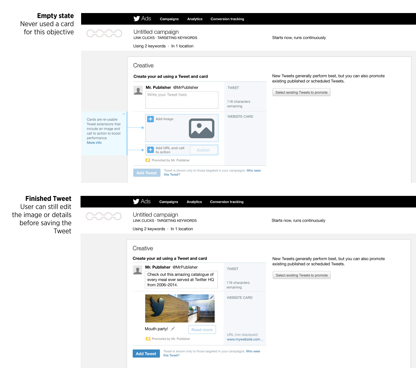
My original design proposed a “creative composer” section on the campaign form that tried to show what the ad would look like at the same time as soliciting the input required to create it. In other words, the form input doubled as a preview. In testing though, users still struggled to understand what to do, particularly while setting up website cards. Ultimately we moved forward with a design that emphasized the required input with a separate preview showing how it looked. The final design also drew a greater distinction between the mode of creating new tweets and the mode of selecting existing ones.
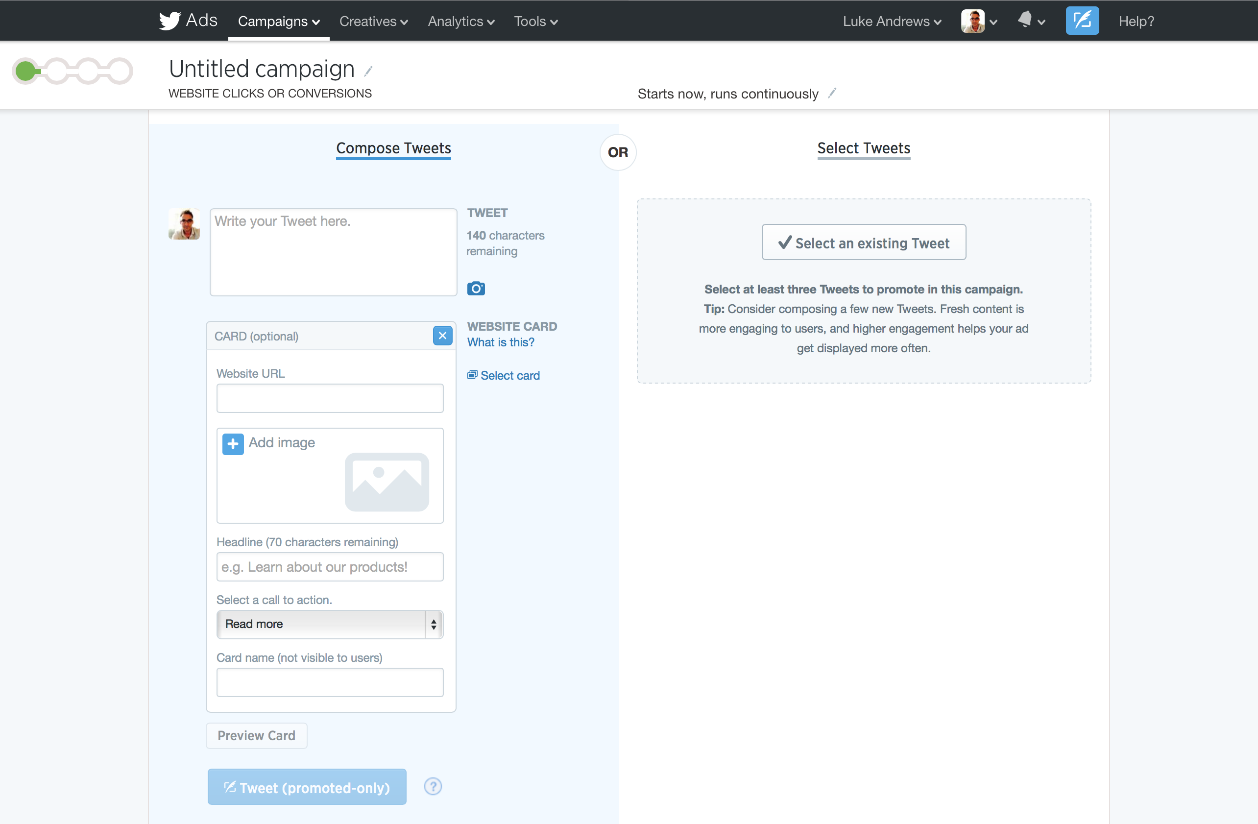
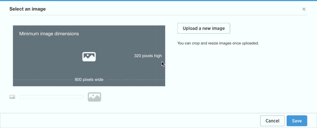
For most types of cards, we needed users to upload an image to use. The existing process for this was brittle: users were asked to format their image to an exact size and aspect ratio, with no margin for error. I proposed that we offer a simple resize and crop tool, so that no matter what image users uploaded, they could control what portion of it would be displayed and resize as needed. I tried to use as few controls as possible: a slider to resize and the ability to drag to reposition within a fixed crop.
Introducing the objectives
For the introduction to the campaign objectives (designed by another team member whom I supervised), we focused on using simple language and visual elements to explain each objective concisely. As the project evolved, the product team also elected to change how Twitter charged advertisers, moving to a pay-for-performance model, and thus making it more crucial that the design clarify it all for existing and new users alike. The final design presented a list of objectives, each leading to a visual-heavy summary showing how the ad looks, where it appears on Twitter, and how charges and measurement work.
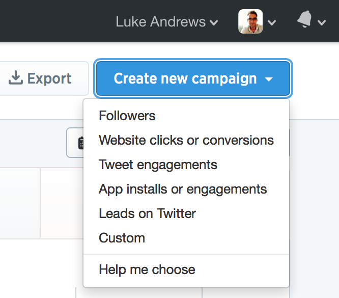
User testing showed us this two-step concept greatly improved users’ understanding of the new products. At the same time, for existing users, it was more cumbersome than the old workflow (two choices with a single click). We designed a faster method to launch new campaigns for repeat users, so the third (or thirtieth) time a user created a campaign, they could pick one from a short drop-down menu, or click “Help me choose” if they still needed guidance.
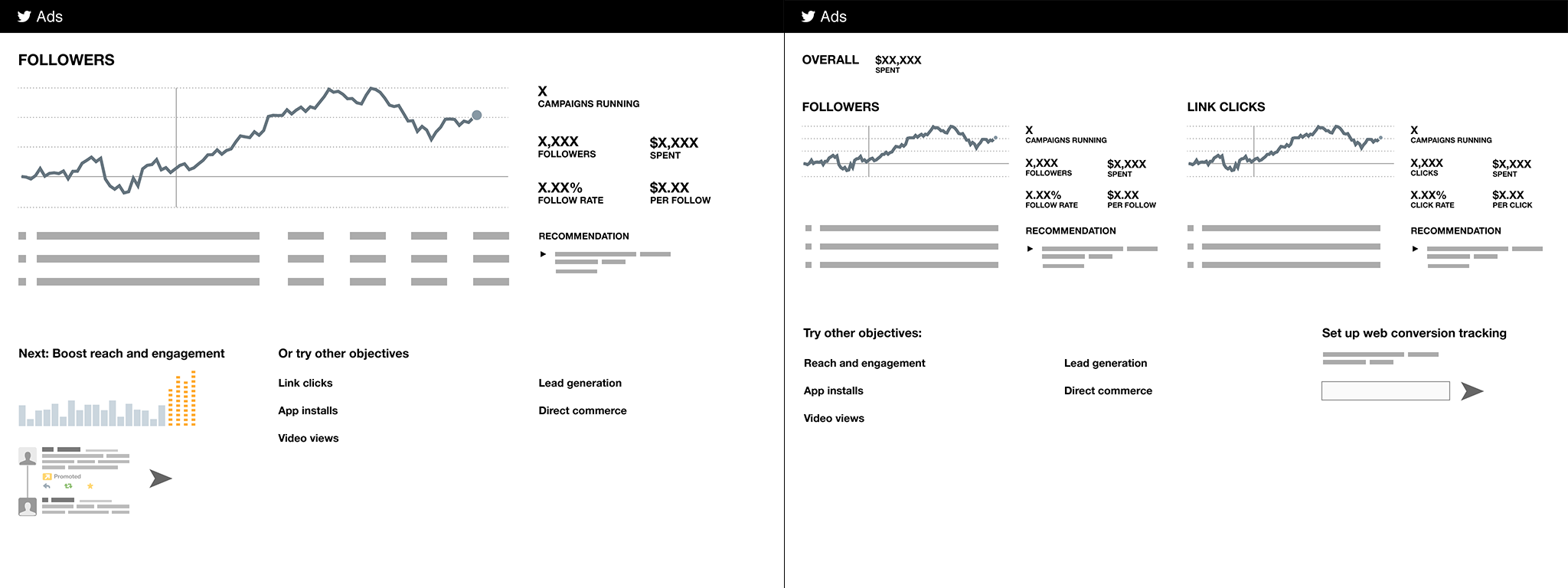
Re-thinking reporting
The last part of the project was improving how we recorded and presented results. My initial concepts involved a homepage that would adapt to users as they became more experienced. For a brand new user, the homepage would offer the tour of campaign objectives above. For a return user who had launched a campaign, it would show the results for their objective, along with prompts to try others. For users working with multiple campaigns, it would summarize results for each objective (rather than trying to aggregate everything). Ultimately, the scope of this work was very large, and the team opted for a smaller set of changes to ensure that the data our advertisers needed would be available for the new objectives.
Results
The objective-based campaigns project launched in Summer 2014, and was hailed both internally and by outside analysts as a success — both for introducing new capabilities (such as app and video promotion) as well as making it easier for customers to understand both new and existing capabilities. Advertising revenue for the third quarter of 2014 (July to September) more than doubled from the previous year, suggesting that our customers found it an improvement too. —L.A., January 2015