
The Right Typer, Not the Typewriter
 While I continue to write at a woefully lax pace these days (and yes, I’ll have those other Yucatan photos up Real Soon Now), I’ll take this opportunity to offer up some advice inspired by a comically long-winded discussion about spaces after periods.
I was reminded of a conversation I had recently in which I was pressed to convince someone that one never needs to use two spaces after periods when one is typing.
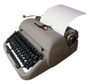
For the reason, a little history is necessary. Many of us learned to type on old computers or typewriters, and we were taught to use two spaces to separate sentences. The printed text in this era was inevitably in typefaces like Courier, in which every character — every letter, number, mark of punctuation and even every space — takes up the exact same width.
Adding an extra space after a period was a way to help clarify the division between sentences, since a period and comma each took up an enormous amount of space, thus creating an artificially large gap between words.
Monospace, I say, is bad. Proportional is good.
Monospace, I say, is bad. Proportional is good.
In typography, this is called “monospace” type. Professionally-published material has always been printed using “proportional” type, in which each character has a unique width. Compare, for example, an upper-case M and a lower-case i. (Go ahead, grab your ruler and hold it up to the screen!) Modern-day computers also use proportional typefaces, like the ubiquitous Times, or Helvetica (or even Helvetica’s evil twin, Arial).
Simply put, books, newspapers and magazines have never used two spaces after a period, and neither should you. Well, unless you insist on using Courier, but even the US government has realized that is a mistake, unless your intent is irony.
End the scourge of the typewriter! One space is enough. Honest.
Previously: Un viaje a Yucatán
Subsequently: Qu’est-ce qu’il a dit?
Comments
Here, here! I have never liked two spaces after a period, and when given the opportunity, will always try to persuade others to drop that extra space.
— Patrick Gibson | Mar. 19, 2004 — 1 PM
I believe here in the US the fetish has been given a long life by high school composition teachers.
Most manuals of style have abolished the “requirement.”
— beerzie boy, anal-retentive tech writer | Mar. 19, 2004 — 2 PM
I agree. As long as the text is legible, two spaces is unecessary adn annoying. As much so as hearing someone give a speech where you can see them counting to three for every period in the text. Not every sentence you utter needs that much emphasis! (Thanks…I needed to rant!)
— Julia. | Mar. 19, 2004 — 5 PM
The Mac is not a typewriter?
— Kate M. | Mar. 22, 2004 — 11 PM
There is a great book by Robin Williams (the computer book author, not the actor) called The Mac is not a Typewriter (there’s a PC version as well). It should be required reading for every computer user. I think the two spaces persists in the Windows world in particular because of the long legacy of DOS.
Robin Williams also wrote The Non-Designers Design Book, which is also a must read with lots of good advice.
— brad | Mar. 30, 2004 — 4 PM